Project Details
Client Confidential
Timeline 3 months
Tools used Figma, Illustrator, After Effects, Photoshop, InDesign
Role UX Product Designer
Brief To revamp the career navigation portal
Career Navigation Portal Revamp
Redesigned the UX of the green career navigation portal as part of the NYSERDA Clean Energy Internship Program, using wireframes, user flows, and prototypes to successfully transition the platform from B2B to B2C use.
Designed to bridge the talent gap through inclusive, data-driven solutions, the platform offers personalized job recommendations, local training opportunities for in-demand roles, and insights into projected green career trajectories, empowering individuals to build sustainable futures.
Project Impact
Improved design resulted in 2x the number of completed career assessments within the first month by strategic UX interventions
Captured the platform’s USP by visualizing projected career trajectories through simple motion graphics and interactive animations
Redesign led to 50% lesser customer support tickets
Decreasing time to value and increasing ease of customer adoption by 65%
Deliverables
Website Audit
Brand Strategy and Colours
Stakeholder Interviews
User Journey Mapping
Product Alignment and Messaging
Information Architecture
Lofi/Hifi Prototype and Wireframe
User Testing
Current Website Audit
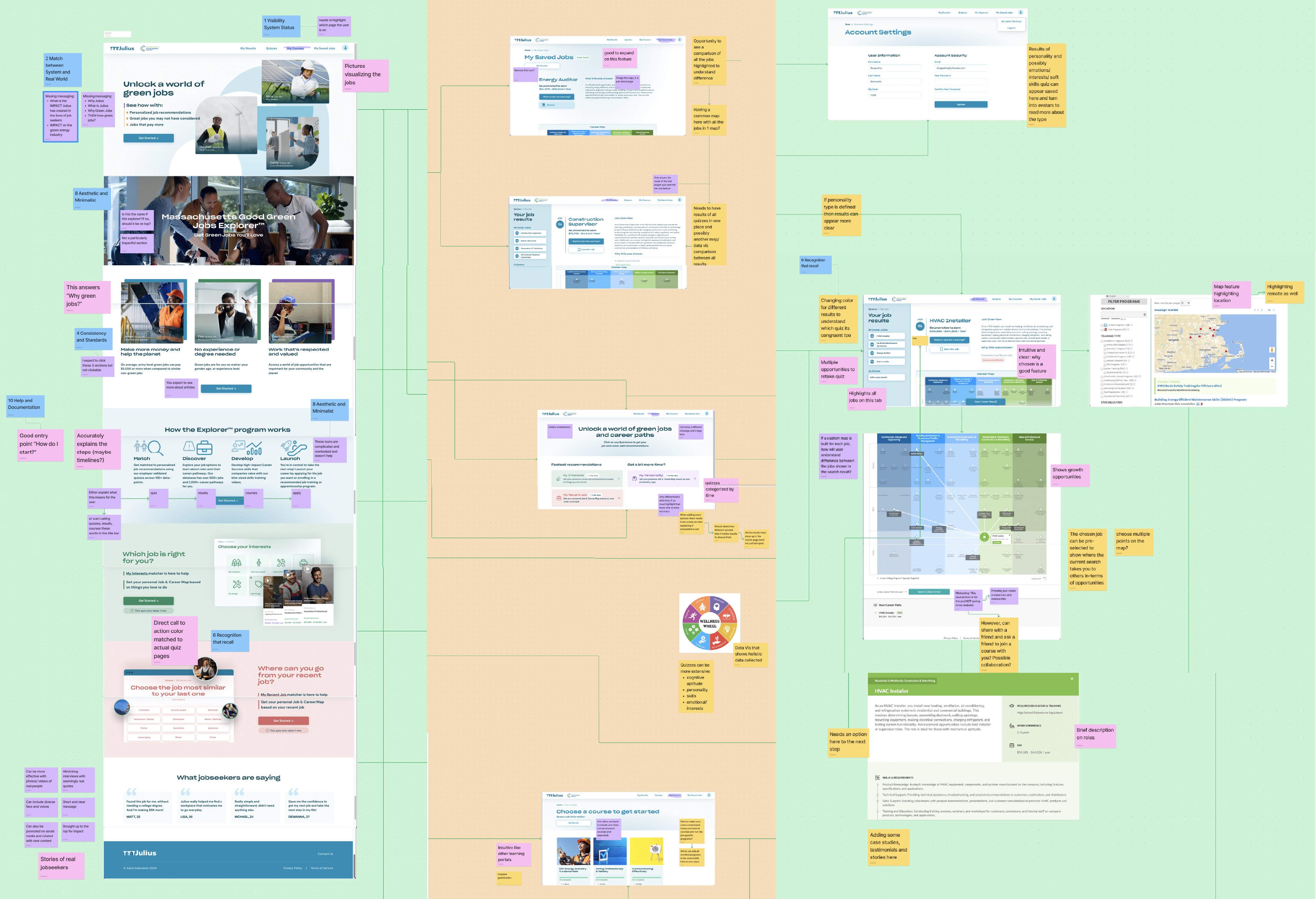
Problem Setting
The current site, originally designed for cohort-based B2B use, lacks the usability, engagement, and functionality needed for independent users. Fails to effectively communicate product value or impact, and lacks user retention.
How might we...
Encourage users to complete career navigation on their own and utilize the various product features like job locator and career trajectories map to visualize futures in green energy.
User Journey Mapping

User Persona
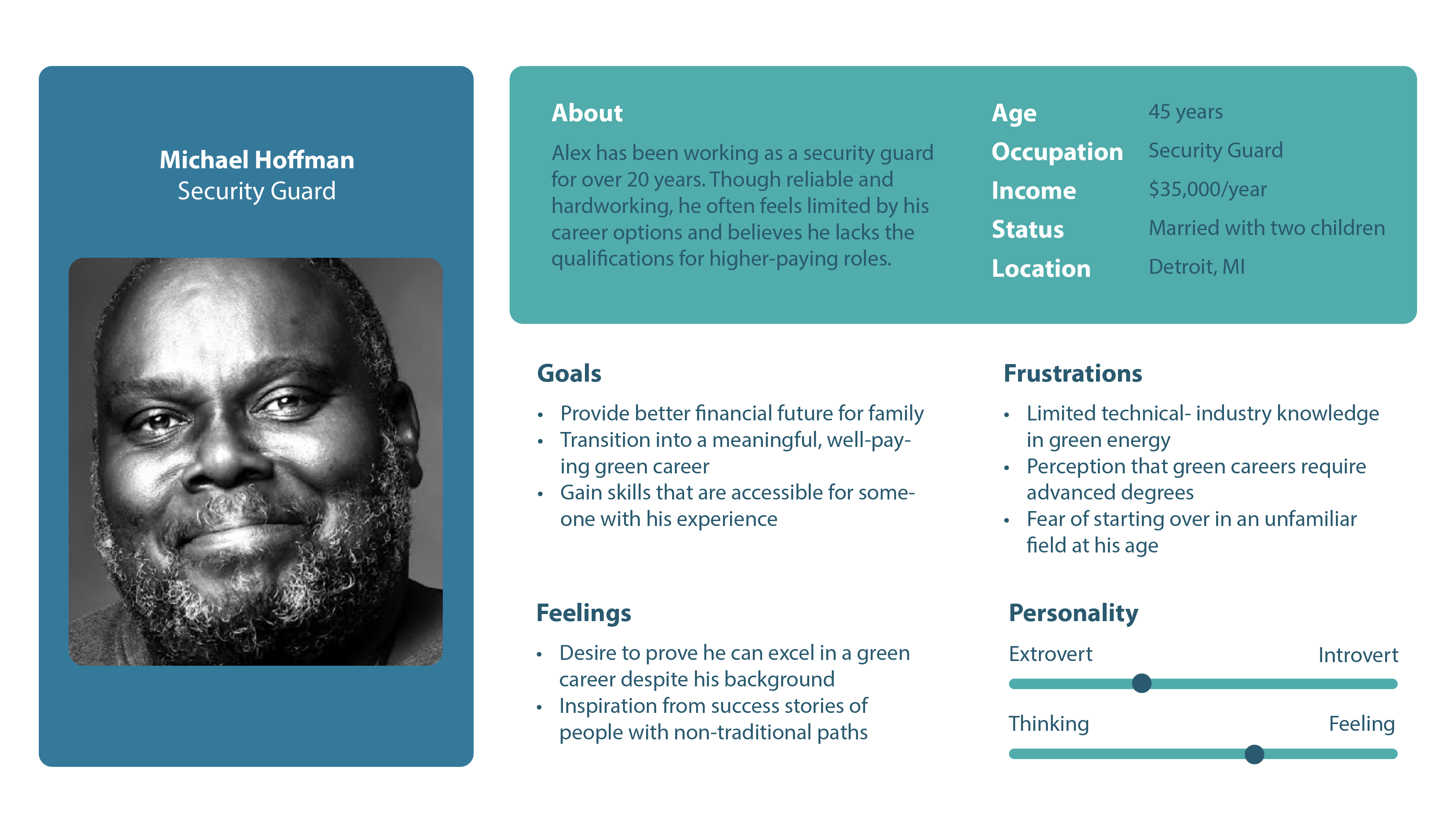
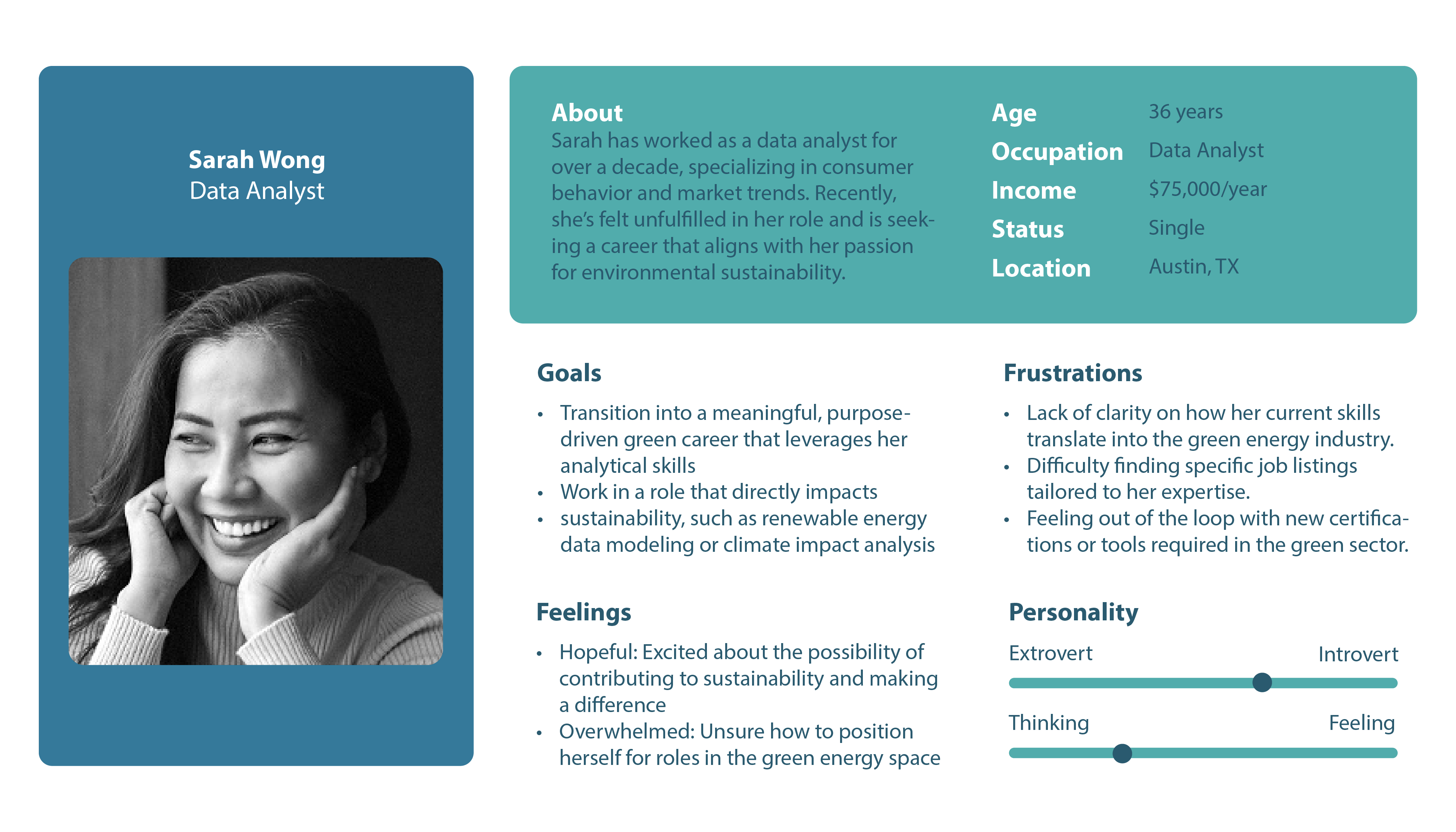
User Research Insights
Growing need to understand user motivations to transition into green energy
Career maps need to reflect real, non-linear journeys
Need help visualizing career transition in green energy, skill transfer
Disconnect between career advice and local job opportunities
Assessment should feel engaging, not like a test
Users value social proof and real-world stories
Many users don’t know where to start—onboarding needs to guide
Career exploration is emotional—users seek encouragement
Research Insight Translation to Features
Home page highlighting impact through messaging
Showcasing product features and benefits in a short span
Improved user experience and better assessment experience
Reiterating collected data as evidence of accuracy
UI that reflects ideas as metaphor i.e, bookmarked jobs, non-linear timelines
Gamification and using avatars to add personality
Low Fi Wireframe

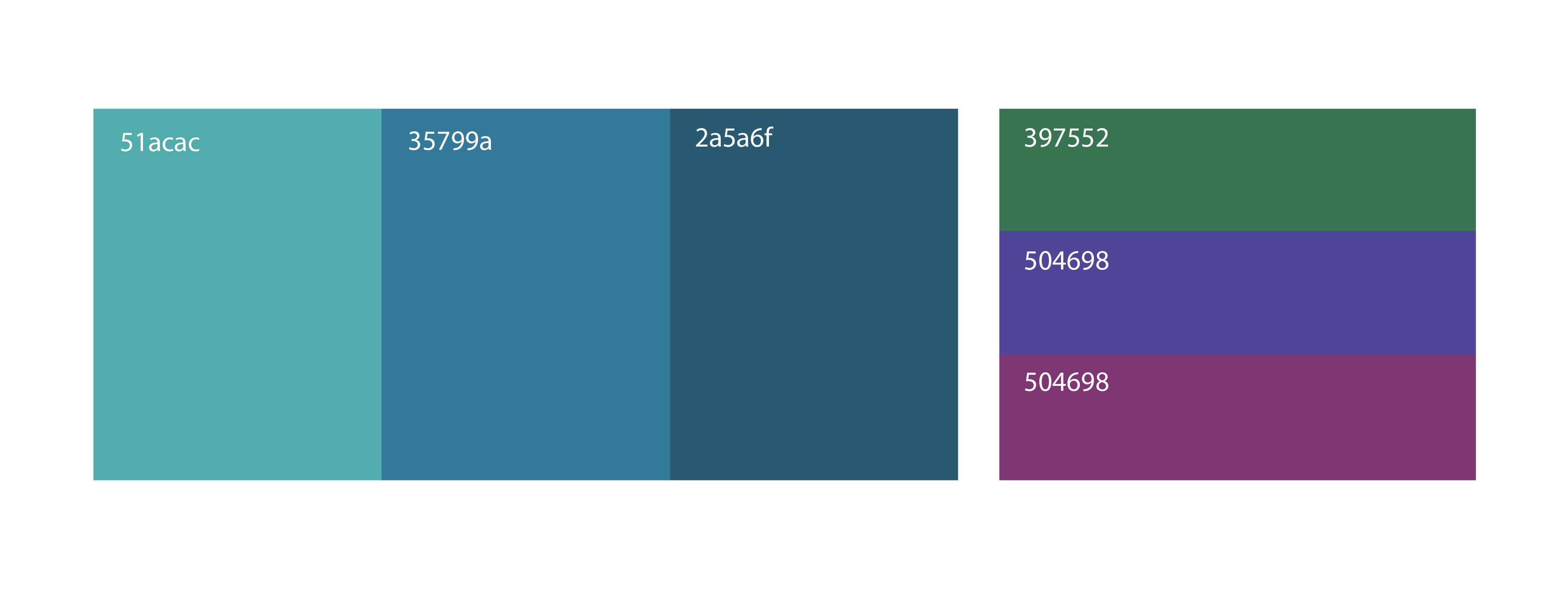
Colour Variations
Instead of defaulting to an obvious green—often associated with sustainability but misaligned with user motivations—I focused on what users actually prioritized: job prospects and trust. Users wanted a platform that felt reliable, approachable, and motivating. After exploring a range of palettes, I landed on a fresh, blue-green teal that balances credibility with optimism, offering a more nuanced and user-aligned visual identity.

Colour Rebrand
Hi Fi Wireframe Screens
