
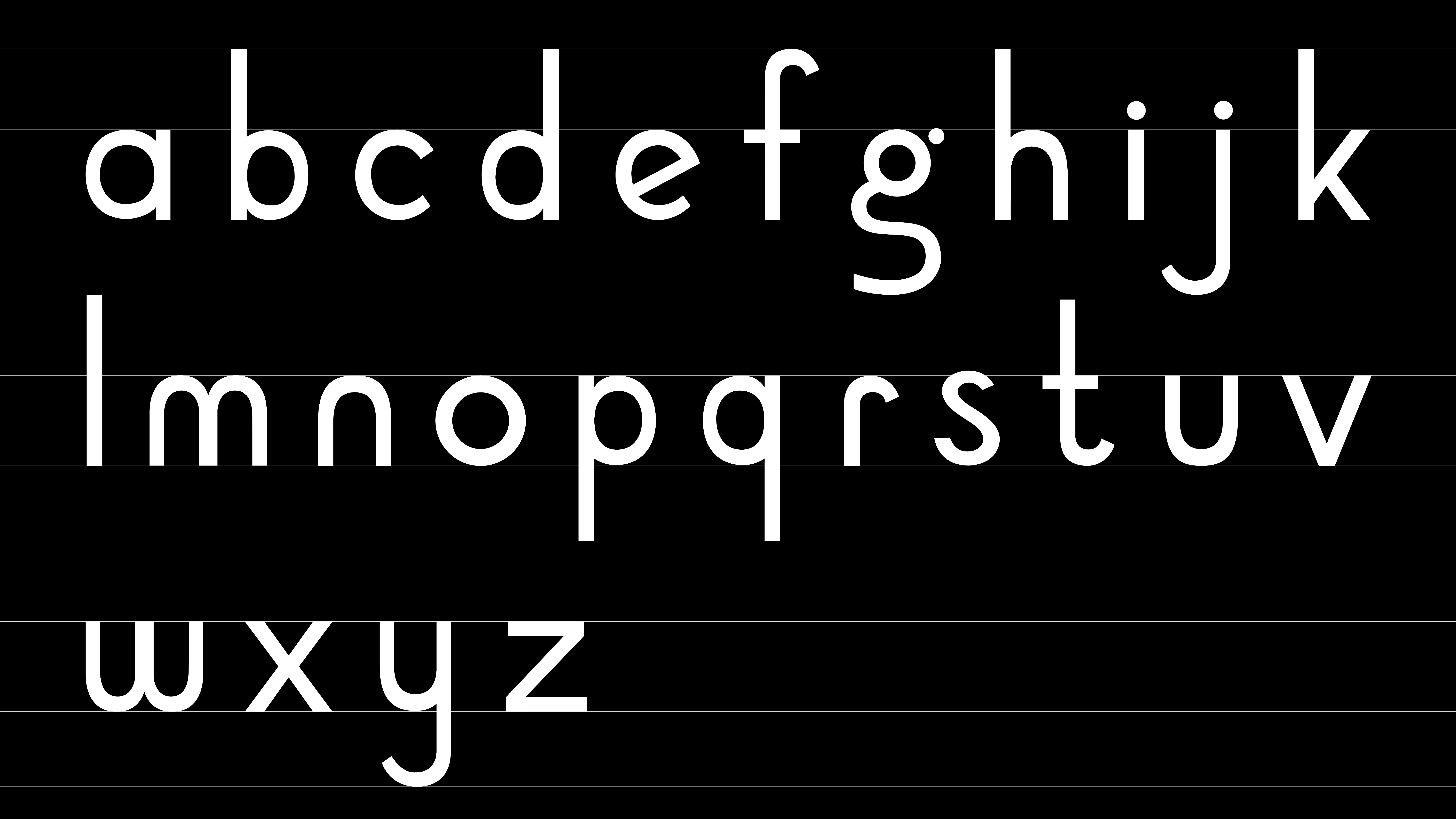
About
A geometric humanist sans serif typeface with open counters and a diagonal angle. This display typeface was created to exhibit friendly playfulness while being logical. The idea was not to average out all the letters but to retain fun characteristics that hold interest. The wide, circular uppercase letters collaborate with the long, rectangular lowercase shapes to form a tempo in the sentence.
Ogie is a typeface that combines wide geometric letterforms with condensed vertical letters to create a word with an inherent rhythm. Since the letters "o," "g," and "e" were signature letters that are prime examples of the typeface’s personality, they were combined to form the name. The phonetic quality, the reference to the slang usage "OG," and the visual play caused by the intermingling letterforms were also reasons for choosing the name.


Typeface Design
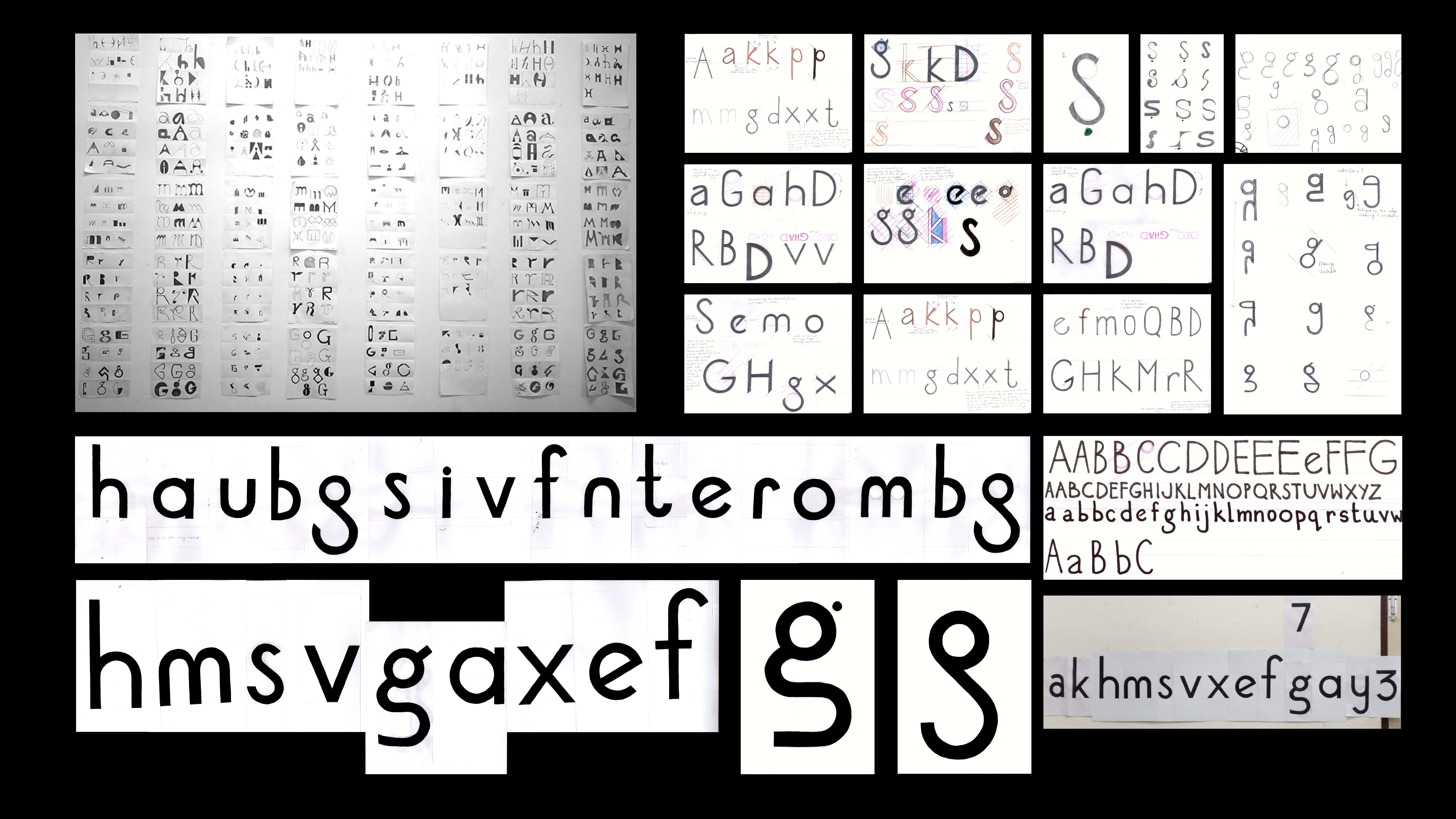
A 5-week, work-in-progress type exercise to understand letterforms and to deal with graphic elements intimately. The process included an initial brainstorming and thumbnail stage that led to the exploration of letterforms at a skeletal level, pushing the boundaries of proportions and avoiding ornamentation. Some chosen directions were further inspected based on potential.
The aim was to focus on assessing structural integrity and not be distracted by the aesthetic that comes with high-contrast stroke widths. At first, it was constructed using derived grids based on the inherent features of the letters. Later, it was enlarged to imperial size for optical correction. Finally, it was digitised with sensitivity towards the software’s effect on the curves and corrected accordingly.